Contact us:
+34 664 192 980
info@habitarmonia.eu
How to use color with Biophilic Design
“The relationship between humankind and nature can be one of respect and love rather than domination...The outcome...can be rich, satisfying, and lastingly successful, but only if both partners are modified by their association so as to become better adapted to each other...With our knowledge and sense of responsibility...we can create new environments that are ecologically sound, aesthetically satisfying, economically rewarding...This process of reciprocal adaptation occurs...through minor changes in the people and their environment, but a more conscious process of design can also take place.”
René Dubos,
The Wooing of the Earth
Biophilic design is good for the bottom line —it produces real benefits backed by science.
There’s a common misconception that biophilic design is a luxury—accessible only to those with deep pockets. But small shifts in built environments, such as incorporating plants into a space, or changing some colors in good proportion, can lead to a significant return on investment.
In this blog we are going to talk about one of the ways of Incorporating Elements of Biophilic Design into a Space: COLOR
I will continue in different blogs explaining which are the 12 ways to incorporate elements to Biophilic Desing into a Space.
When picking up suitable colours to create a biophilic space, we have to take a look at NATURE. These are naturally inspired colours which can help us feel better in the places we live, sleep and work.
SKY
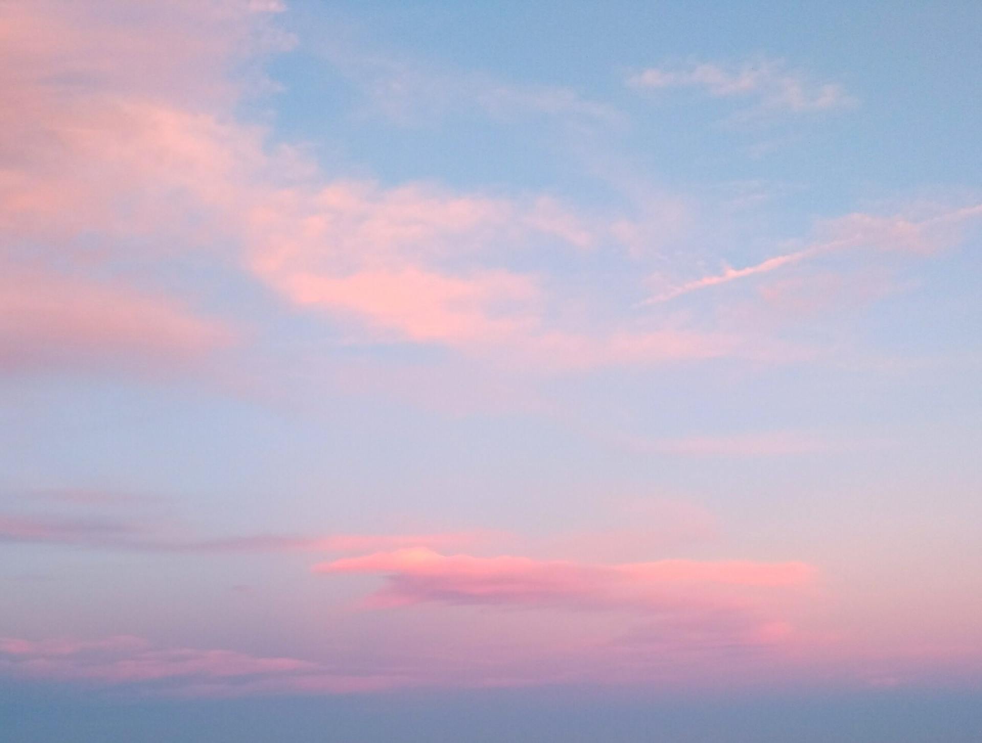
From the pale white skies near the horizon to the vibrant mid-blues of a summer’s day, the sky is a rich seam of color inspiration. It’s never just one color. The most prevalent feature in our natural environment covers a wide variety of hues, values and chroma – the reddish pink glows of a sunset to the grey, almost translucent shades of an overcast day, the glowing orange-blue of twilight to the washed out yellow-pinks of the dawn.
SEA
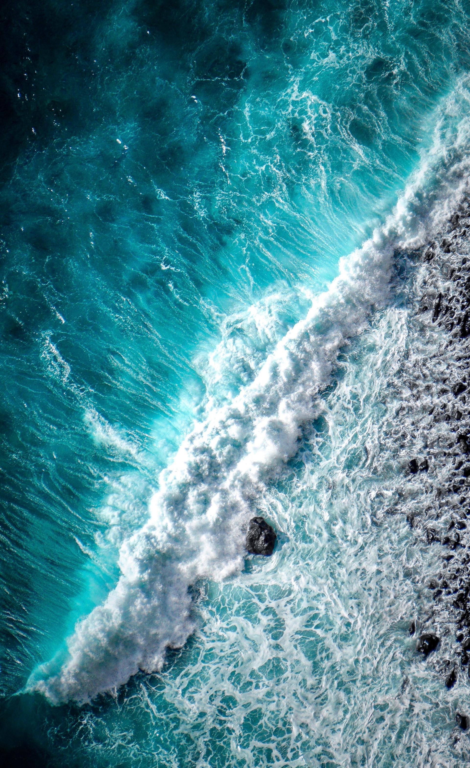
Because we respond so positively to its physical presence and sound, water is also worth exploring as a biophilic color, with its subtle range of colors. The sea can roll with thunderous grey waves, for example, or read as a calm, flat stretch of green-blue. On a sunless day, stretches of water can be pale off-whites or froth with white-blue foam. The prevalence of blue in the natural world – both in the sky and bodies of water – may explain why it is still the world’s favourite color. A YouGov survey conducted in ten countries across four continents showed that one color – blue – was consistently picked as the favourite.
PLANTS
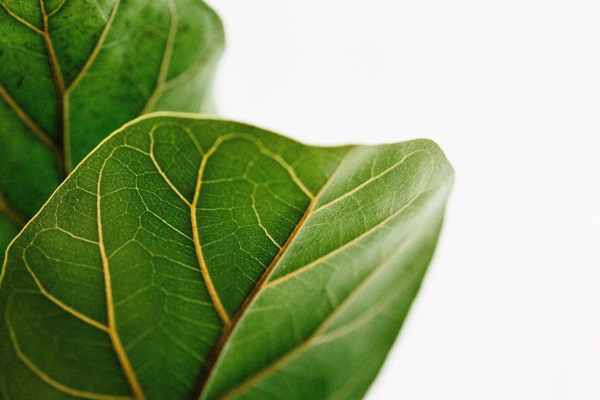
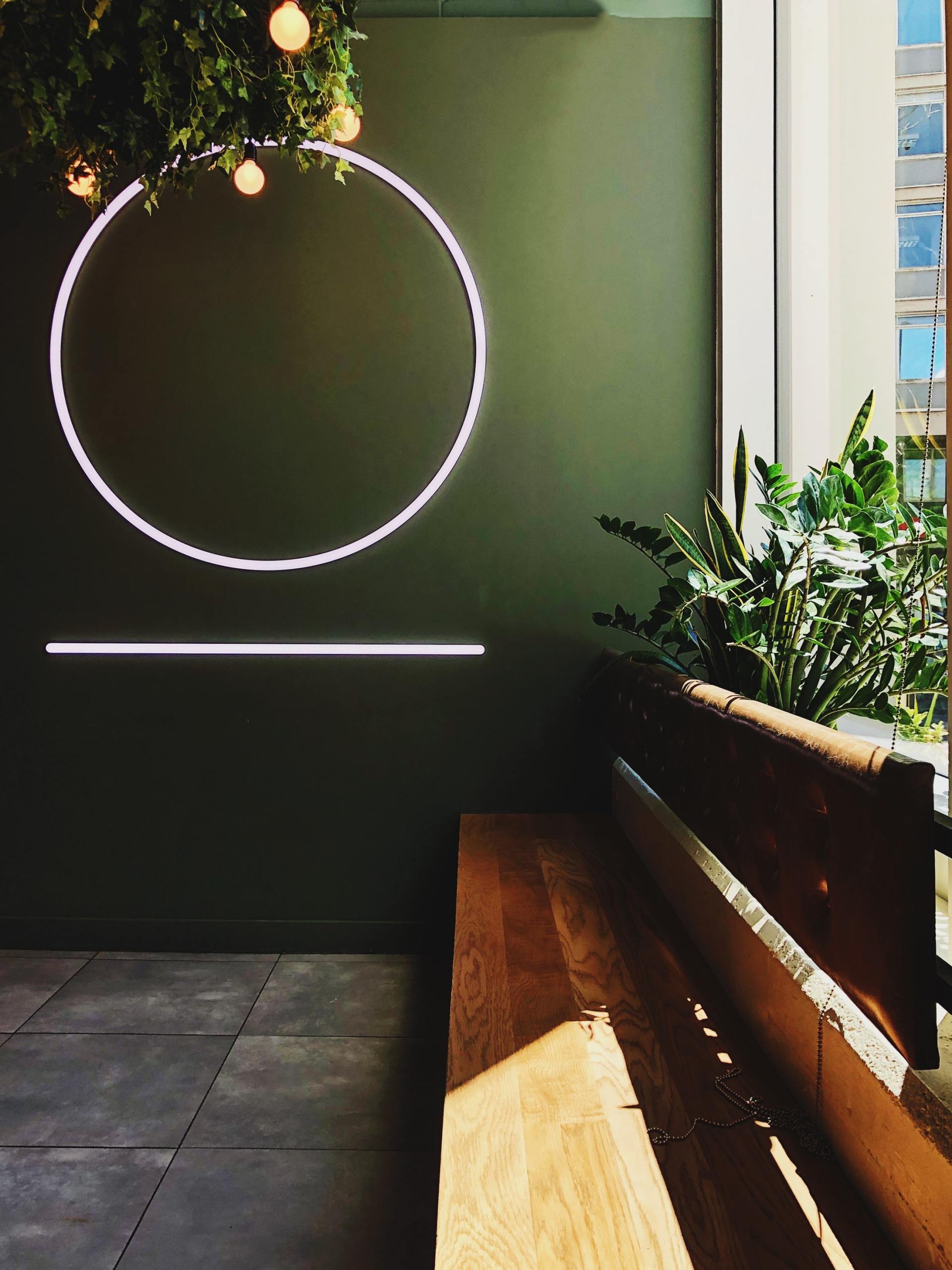
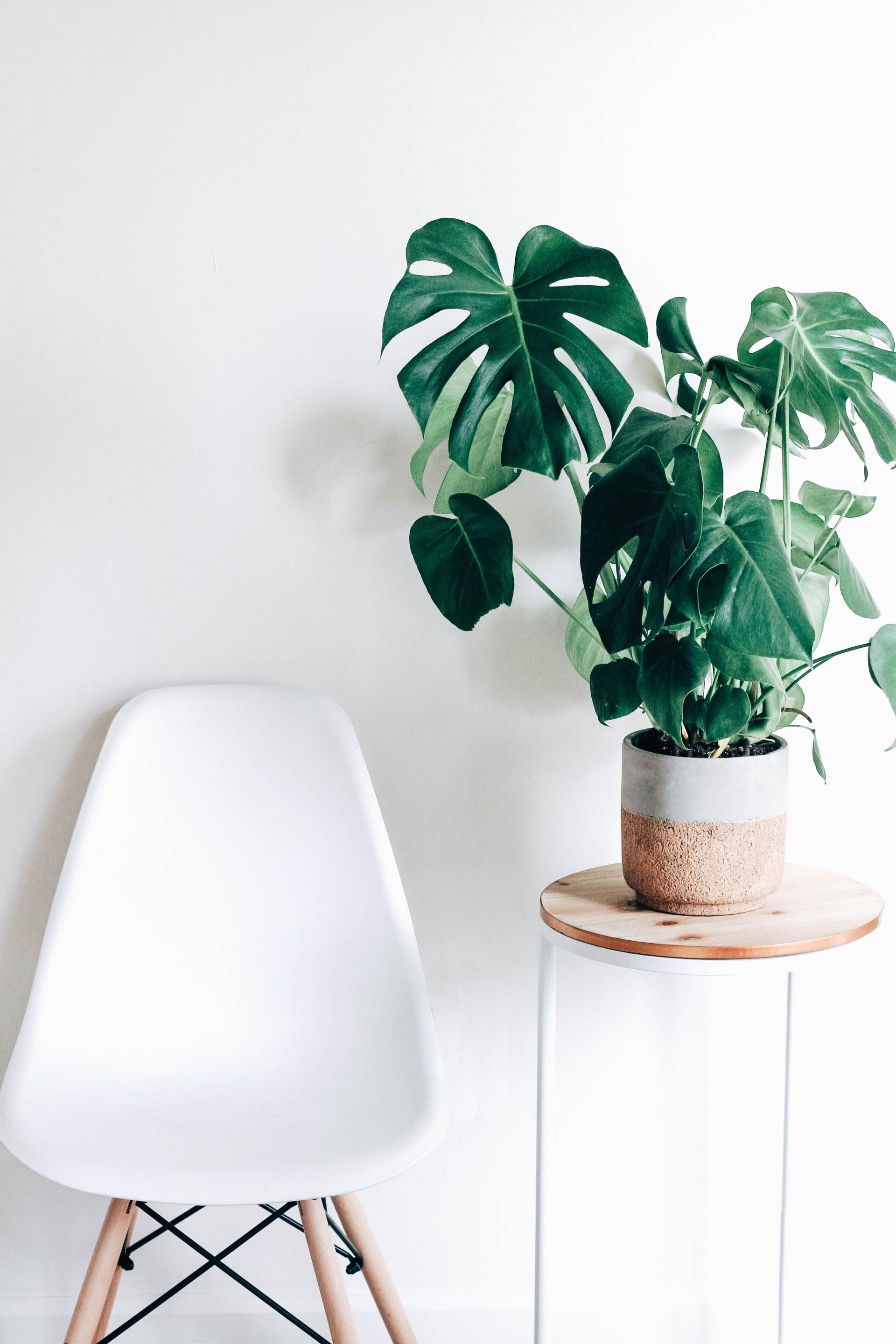
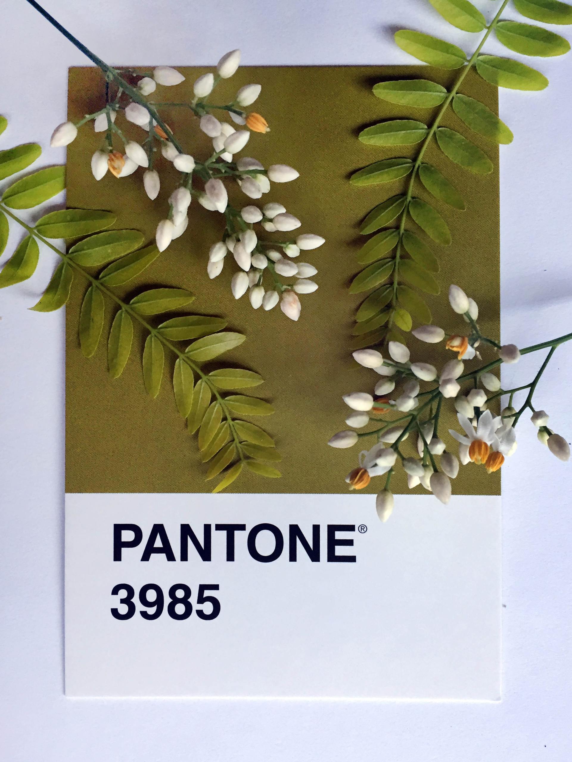
After blue, green is the second most prevalent color in the natural world. It’s the color of renewal, growth and plant life – a color we implicitly associate with forests, fields and other fertile landscapes. It’s also a color we find comfortable to live with; scientists believe that, because our eyes – in daylight – detect wavelengths corresponding with the color green more readily than any other color, our brains and nervous systems feel calm when we look at green.
Looking at green foliage has been shown to increase attention span and concentration levels, so it may be a good color for work or study environments.
EARTH
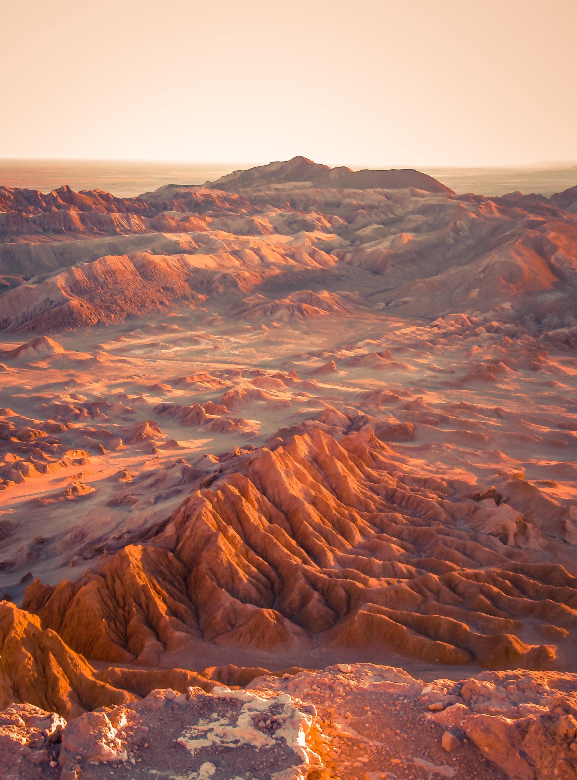
The other colors that dominate our natural landscape are earthy tones – the gentle browns, grey's, stone shades and sandy hues that characterize the rocks and pebbles in nature – from wood shades to soil, skin pigmentation to fur and human hair – different permutations of brown conjure up notions of rustic living, raw undyed materials such as timber or wool, autumn colors and natural pigments.
These was inspired by the book: Biophilia by Sally Coulthard
YOU are more than welcome to visit my Website for more BLOGS and information
